Moderator context: This CSS-placement and contrast question follows the Khal Yereim display-layout review. Keep the specific hero-card CSS discussion here.
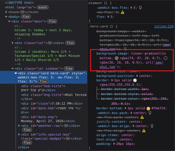
What part was your code suggestion for? background-image: linear-gradient(to bottom, rgba(0, 0, 0, 0.7), rgba(0, 0, 0, 0.9)), url('img/shul.jpg');
Lol I guess I thought you made it yourself but I realized after it was claude so u wouldnt know where to put it
Inside <body>, third div from the top, inside that the top div who’s class is .hero-card, the css goes in there. You’ll see the original code which is slightly different rgb numbers so you can just swap it out.
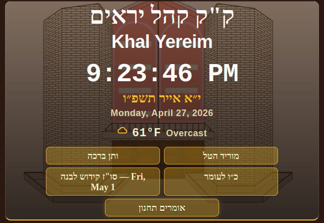
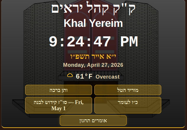
For example look at “Monday, April 27, 2026” its much easier to see on the darker version, and while you can read it on both for some older members of your shul you might want to switch it