this?
Nuu?
Are you asking if I used one of their templates?
No. I redid the main tech site
A+.
Beautiful.
I’m not going to comment on that terminal…
I see you tried to make it similar to the wonder phone website…
I’m scrolling but its just showing me more and more pictures and words instead of actually doing what I told it to do, just scroll ! 
And what is scrolling if not showing you more pictures and words?
I’m assuming that you haven’t looked at any of the other sites that were posted in this thread.
Most of them have similar ideas.
It’s called scrollytelling, or scroll-triggered animations, and it’s it’s a pretty common modern web-UX trend.
 Creative Bloq
click X to dismiss it…
Please give me feedback on what can be improved
Very nice.
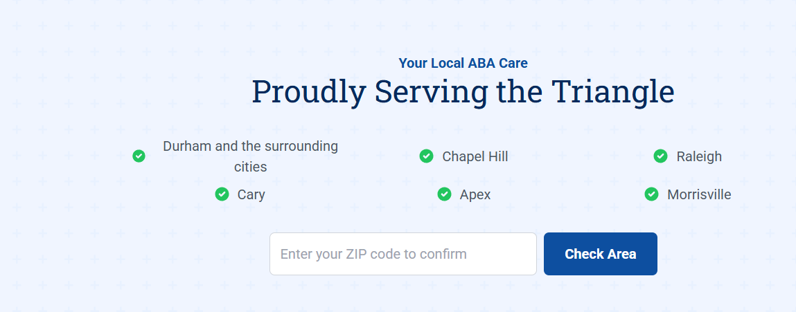
I would straighten this out.
And the address on the bottom I would make clickable.
Privacy policy and terms & conditions don’t lead anywhere.
Was kinda shaped like a triangle. what do you think @Dev-in-the-BM_2.0
This company is not yet open…
To Google Maps? To what? Its not a real address its a virtual office
After a cursory glance, looks nice.
This should probably be fixed
mentioned
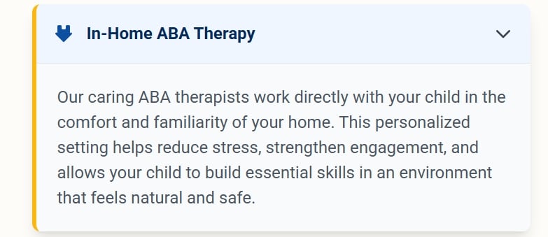
And the what @PleaseSmileToday mentioned. At least the word “cities” shouldn’t be on the next line. Looks messy…
Fixed
I made a new GitHub profile page today. Not finished or perfect, but I would love to hear feedback moshewelcher.github.io
I am aware that my stats are horrible lol
Thanks
Love Total Chaos Mode
Love the style!