I’m getting ready to launch Matzav Market and would really appreciate some honest feedback on matzavmarket.com. It’s 100% free to post, so please test it properly as a normal user — browse around, create an account, search, try the different sections, and check both mobile and desktop if possible. If you have something genuine to list, please use a real listing rather than a test/fake one, as this is the live marketplace. I’d like to hear about any bugs, broken links, confusing wording, layout issues, anything annoying or unnecessary, anything missing, or any changes you think would improve the site. Please mention your device/browser if you find a problem. Positive feedback is also welcome if there are parts you genuinely like. Don’t hold back — constructive criticism is exactly what I’m looking for before I properly promote the site.
It says Uk market?
im starting off by launching it in the uk as thats where i am from
Looks great overall:
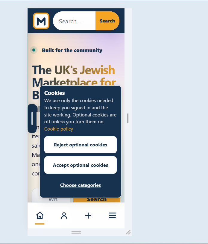
Layout is nice and clean, colors work well, and having sections like Lost & Found alongside standard buy/sell is a brainy idea,Mobile feels a bit packed:
On phone screens, between the top search bar, the cookie popup, and the bottom nav bar, it gets pretty crowded. Might wanna trim down the cookie banner height so the content can be more cleanish vibe
Text contrast: Some of the grey text on white boxes (like “100% free to post”) is a bit light and hard to read against the background. Darkening it a touch would help a lot.
Nice work overall though, super close to ready!
This is a marketplace for second hand like eBay?
…please provide more infoThis forum is mostly usa chevrah so. Either open it up for usa or?
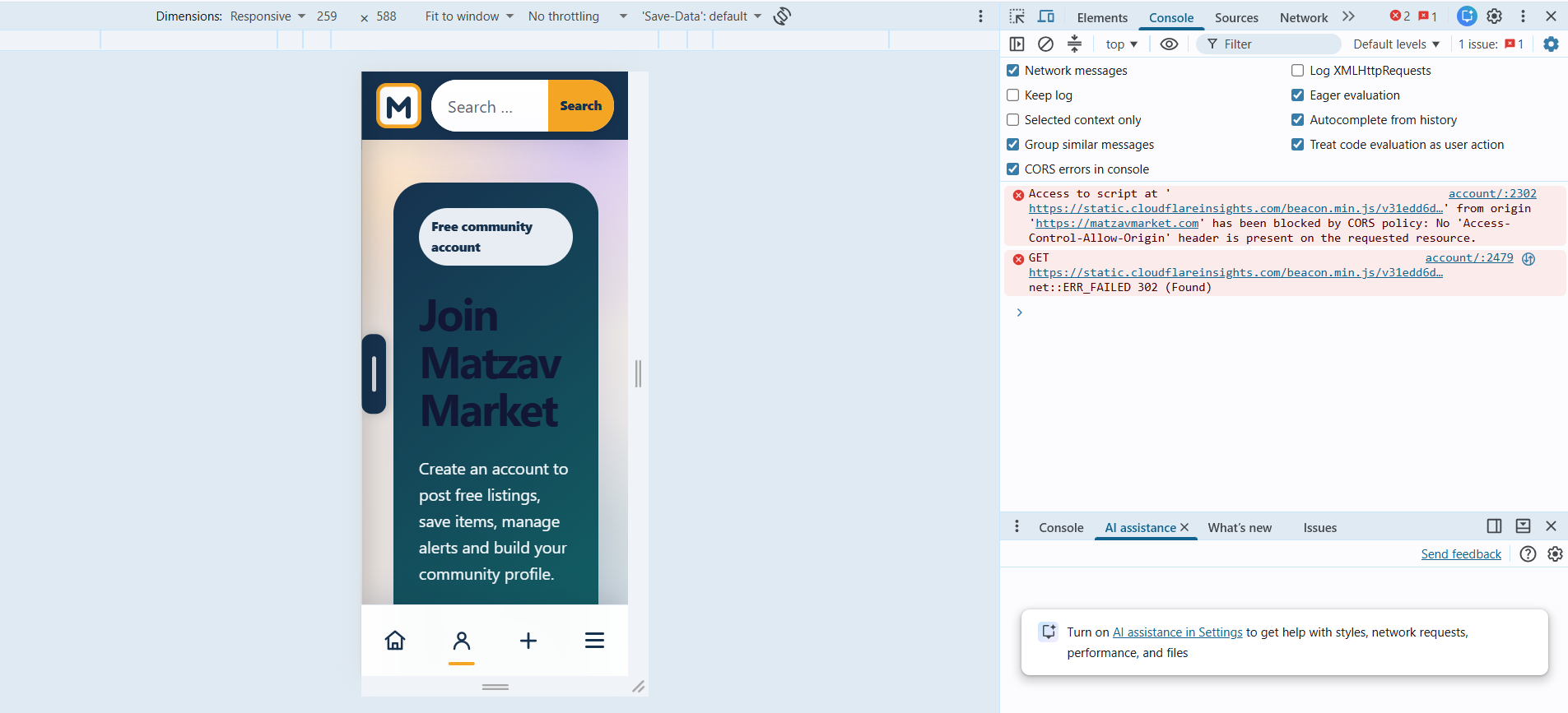
whats wrong with the loggin page?
the idea is for it to be a modern version of something similar to craiglist. the plan is to shortly open it up for the usa.
evrything just looks squashed or mabye that cuz i’m on my laptop
show me some screenshots please so that i could see what you mean.
i just want to launch it first in the uk to see that it works.
Poor contrast on this page:

The words “post free listing” are confusing. It sounds like you can only post something for free. It should say “List anything for free”

There should probably be a “Sell” Tab


How about FAQs being sorted into categories instead of just being dumped in a giant list?
I tried uploading a screenshot here but it was crashing the post
Looks like slop
That’s useful to know, but “slop” is a bit broad. Could you say what specifically makes it look that way — the design, wording, graphics, spacing, mobile layout, or something else? I’m actively fixing things before launch, so specific criticism would be much more helpful.
Whole thing gives slop vibes. Try to be sharper and cleaner I guess. I dunno. It’s just first impression.
Hi, thanks for your feedback. I have looked at what you reported about and I agree to what you have said. I have already fixed it based on your feedback including making the website more clearer what it is and what it is about and making the cookie banner on a mobile phone thinner to make it less crowded. if you have found any other problems please don’t hesitate to give some more constructive criticism so that I could perfect everything.
on what device are you viewing the website on so that I could see the website from your viewpoint please? Also, if you could please be more specific so that I don’t need to rack my brains please?
thanks for your feedback. I have sorted out the contrast issue you reported about and have also added a clear selling navigation in the header navigation according to your report. I also have made the post free listing icon be more explicit and clearer. if you find anything else that needs improving before launch, please don’t hesitate to give your constructive criticism.
I have also added subtitles for the FAQs to make the questions into sections as you requested.
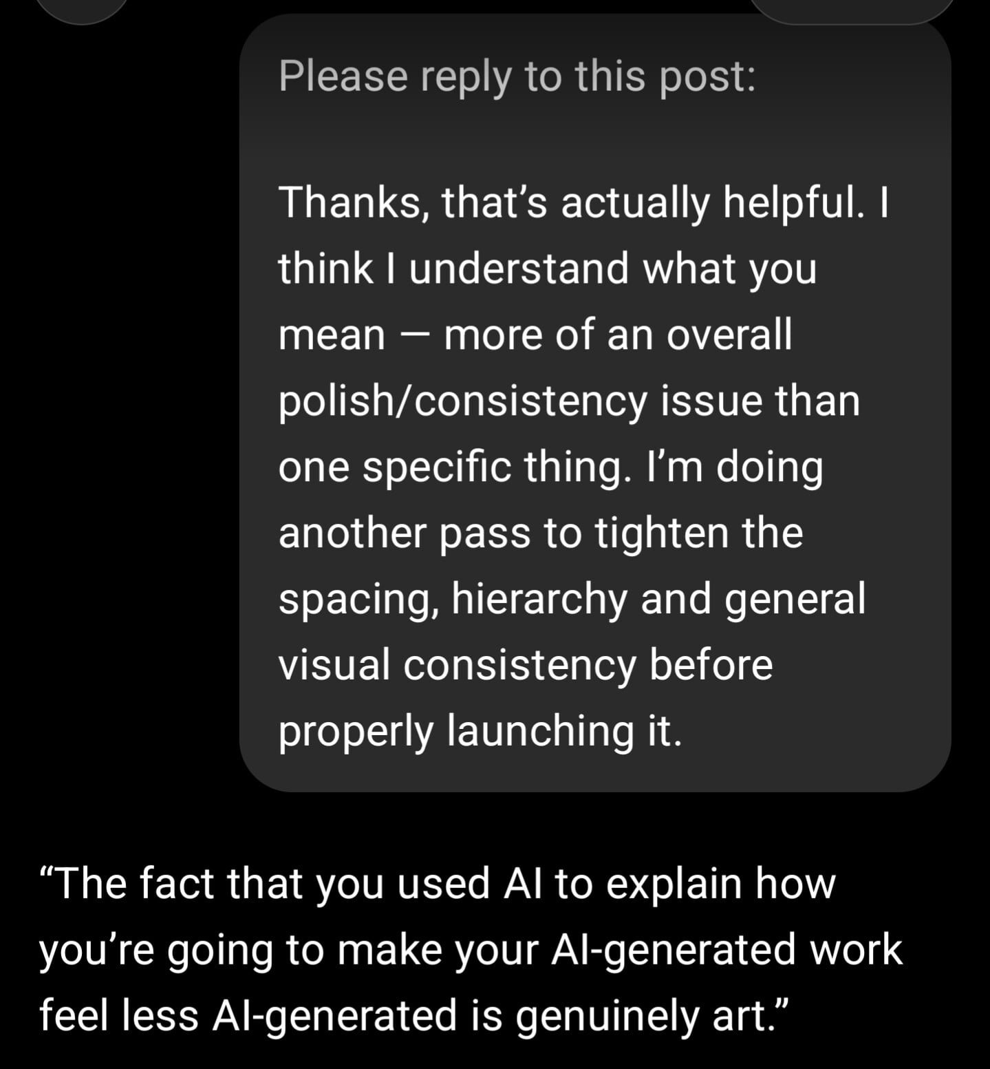
Thanks, that’s actually helpful. I think I understand what you mean — more of an overall polish/consistency issue than one specific thing. I’m doing another pass to tighten the spacing, hierarchy and general visual consistency before properly launching it.